updated Logos below
NEW Updated Options
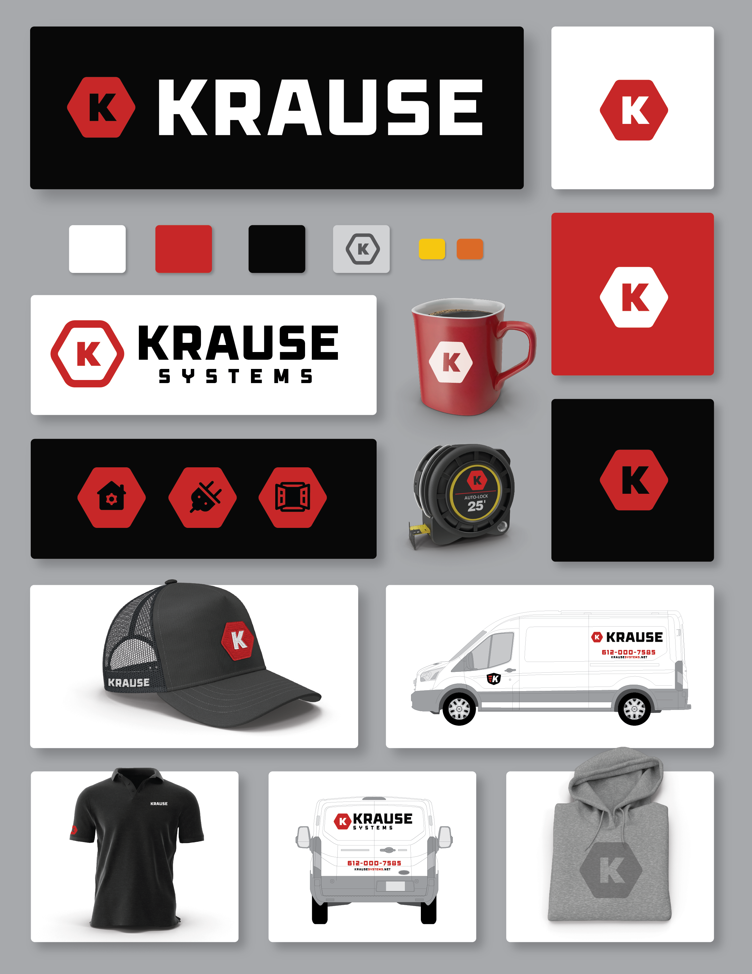
HEX MONOGRAM ICON (K HEX)
Confident. Structured. Built to Scale.
The hex icon combines a bold, geometric “K” with a clean hexagonal frame — creating a mark that feels engineered, modern, and made for hard use. The angular shape and thick letterform give it instant presence across hats, signs, vehicles, and digital platforms.
Color Palette & Brand Feel
Bold Contrast. Built for Visibility.
The color palette uses high-contrast black, white, and red — with functional secondary tones like gray, safety orange, and warm yellow. It’s tough, clear, and commands attention on the jobsite or online.
Icon System
Simple, Strong, Instantly Recognizable
Custom icons provide clarity and fast readability for services: lighting, power, audio, security, etc. These create a visual shorthand that reinforces professionalism while keeping the site and print clean.
Previous Versions
Updated Explored Concepts & Visual Directions
Exploring the K-Hex Concept & Visual Directions
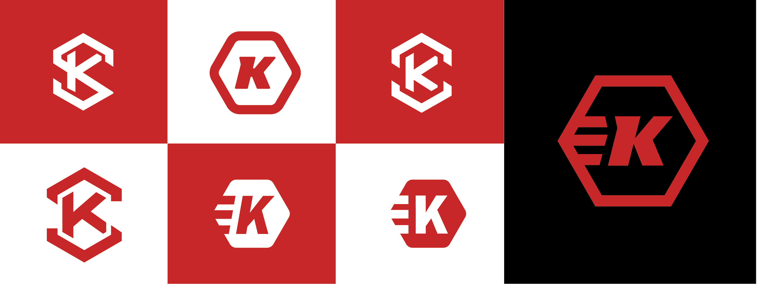
To shape a brand identity that reflects Krause’s strength, precision, and adaptability, we focused on developing bold variations of a stylized “K” within a hexagon — a symbol that suggests structure, modernity, and reliability.
This design study explores:
Geometric monograms that fuse clean lines with bold impact
Stylized “K” letterforms integrated into hexagonal frameworks
Modular marks adaptable across divisions like Krause Electric, Krause Systems, and Krause Media Solutions
Strong shapes that translate seamlessly to trucks, apparel, digital media, and signage
Each variation is designed to support a cohesive, future-ready brand system — rooted in simplicity and built to grow.
Brad’s Top Option
HEX MONOGRAM ICON (K HEX)
Confident. Structured. Built to Scale.
The hex icon combines a bold, geometric “K” with a clean hexagonal frame — creating a mark that feels engineered, modern, and made for hard use. The angular shape and thick letterform give it instant presence across hats, signs, vehicles, and digital platforms.
Color Palette & Brand Feel
Bold Contrast. Built for Visibility.
The color palette uses high-contrast black, white, and red — with functional secondary tones like gray, safety orange, and warm yellow. It’s tough, clear, and commands attention on the jobsite or online.
Icon System
Simple, Strong, Instantly Recognizable
Custom icons provide clarity and fast readability for services: lighting, power, audio, security, etc. These create a visual shorthand that reinforces professionalism while keeping the site and print clean.
Initial logo ideas below
Primary Logo System
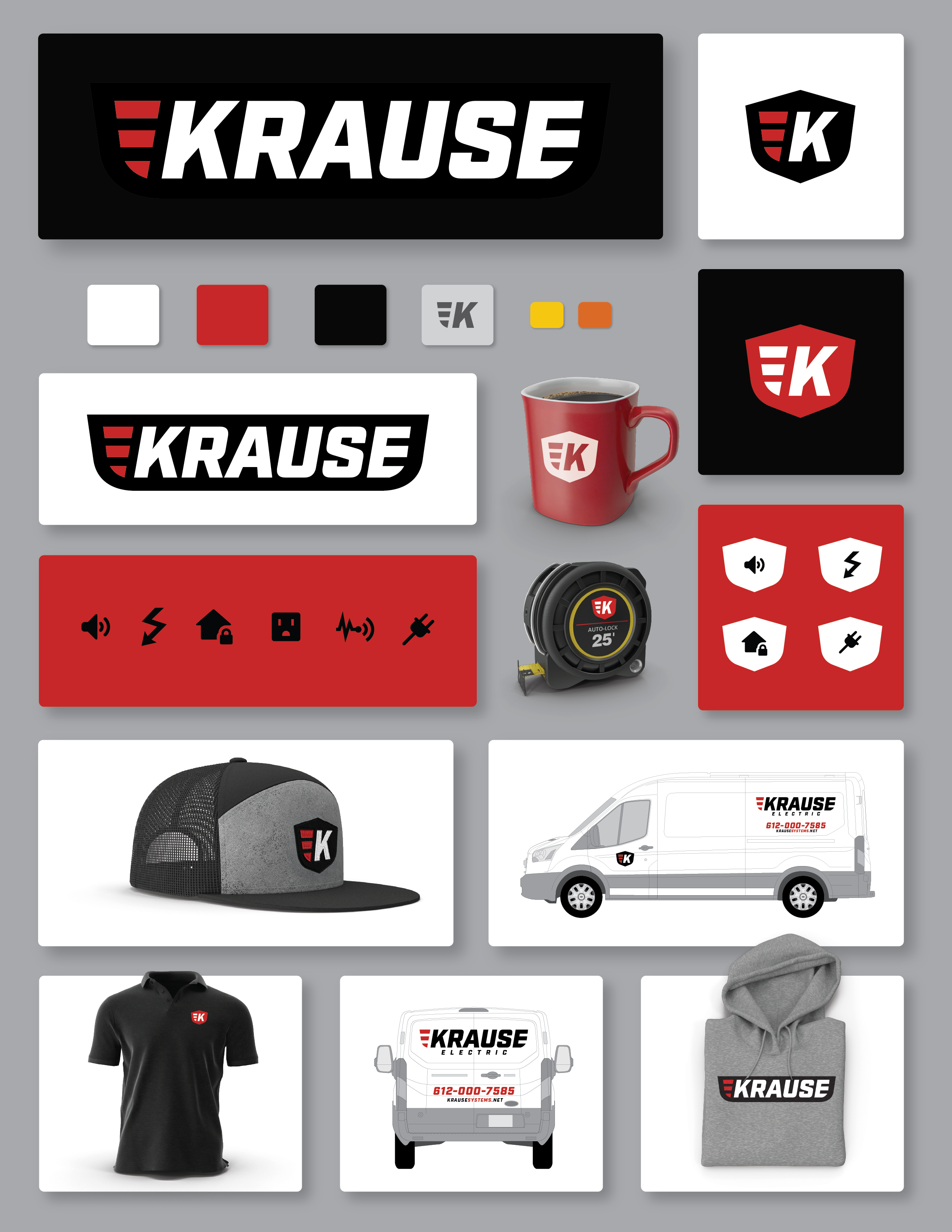
The Krause wordmark is bold, modern, and purpose-built — designed to look sharp across trucks, gear, and digital platforms. The three red slashes suggest motion, strength, and current — tying back to both electrical work and forward momentum.
Applications:
Vehicle Wraps
Workwear
Website Headers
Tool Branding
Monogram Shield Icon (K Shield)
Compact. Iconic. Utility Ready.
The shield icon offers a flexible badge for hats, tools, merch, and social media. With a clean ‘K’ and shielded protection feel, it reinforces trust, safety, and durability — the kind of mark that sticks in memory.
Color Palette & Brand Feel
Bold Contrast. Built for Visibility.
The color palette uses high-contrast black, white, and red — with functional secondary tones like gray, safety orange, and warm yellow. It’s tough, clear, and commands attention on the jobsite or online.
Icon System
Simple, Strong, Instantly Recognizable
Custom icons provide clarity and fast readability for services: lighting, power, audio, security, etc. These create a visual shorthand that reinforces professionalism while keeping the site and print clean.
This is a logo system that’s built for the field
KRAUSE's new identity checks every box:
✅ Clean, modern wordmark
✅ Memorable & flexible icon
✅ Strong color strategy
✅ Ready-to-use visuals across trucks, shirts, and tools
✅ A system that grows with the business — from Electric to Media to Systems
Option 2: Primary Logo
The primary wordmark uses strong, squared letterforms that reflect structure, confidence, and technical precision. Paired with the hexagon "K" icon, the full logo is engineered to stand out in digital and physical environments — from service vans to control panels.
Applications:
Vehicle Wraps
Workwear
Website Headers
Tool Branding
Hex Badge Icon
The “K” Core
The hexagon is a symbol of structure, engineering, and durability. This mark gives Krause Systems a compact, scalable icon that works anywhere: hats, gear, signage, and digital. It’s instantly recognizable and perfect for branded tools, patches, and stickers.
Color Palette & Brand Feel
Bold Contrast. Built for Visibility.
The color palette uses high-contrast black, white, and red — with functional secondary tones like gray, safety orange, and warm yellow. It’s tough, clear, and commands attention on the jobsite or online.
Icon System
Simple, Strong, Instantly Recognizable
Custom iconography built to support key Krause Systems offerings:
automation, networking, AV integration, access control, security, and more. The icons use the hex badge format for consistency and are instantly legible in both small and large applications.
Explored Concepts & Visual Directions
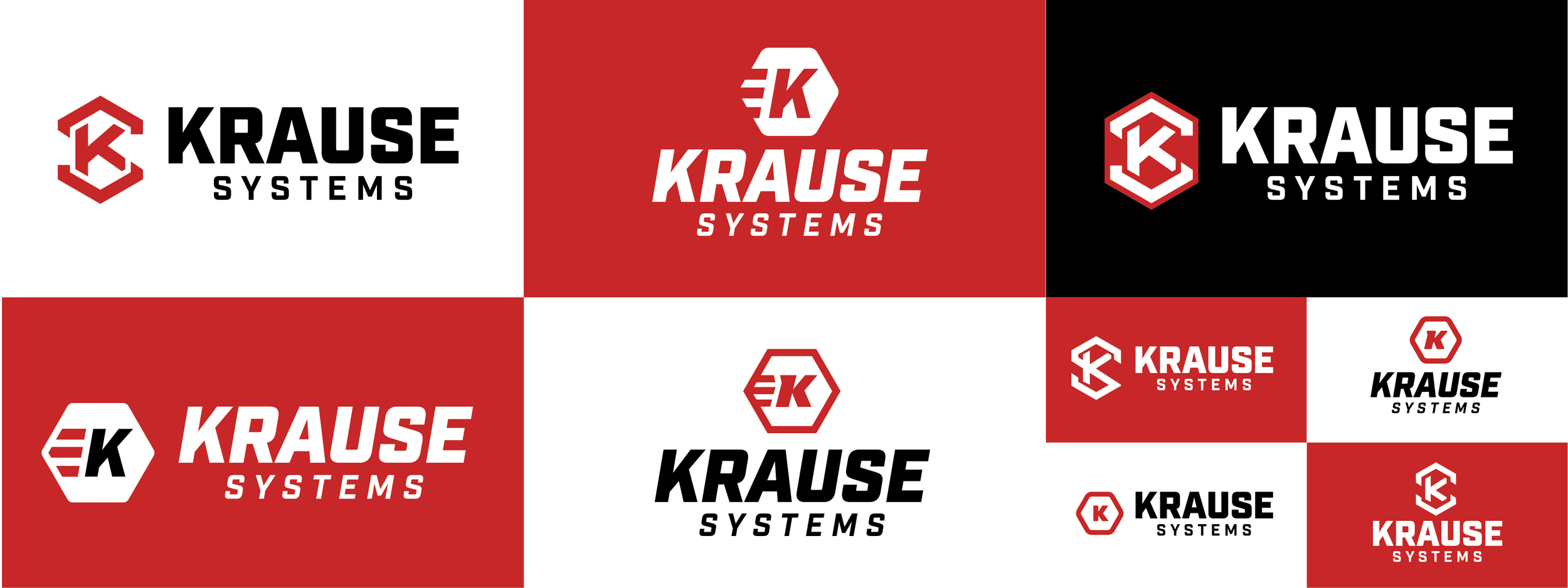
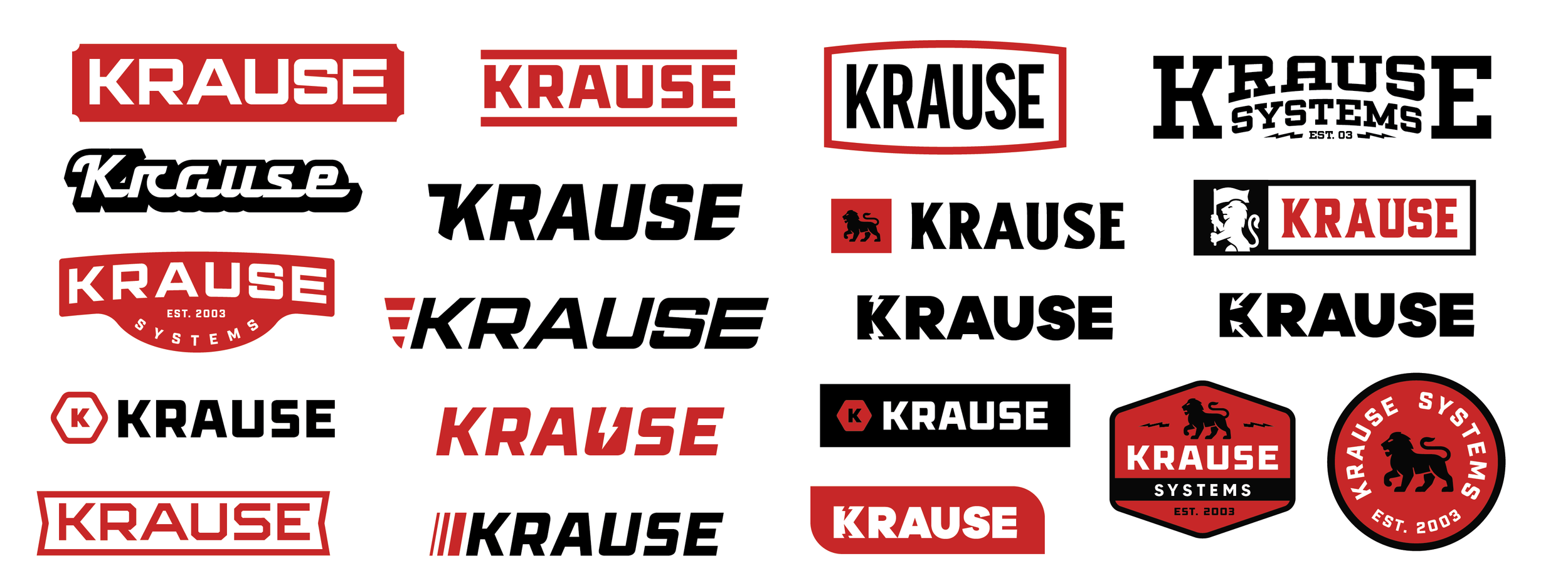
To ensure the Krause brand reflects its strength, versatility, and modern edge, we explored a wide range of logo styles — from bold and athletic, to clean and technical, to heritage-inspired badges.
These variations investigate:
Wordmark treatments for different tones (modern, retro, industrial)
Integrated icons such as shields, lions, bolts, and letterforms
Flexible lockups for trucks, apparel, merch, and signage
Bold typography paired with custom letter tweaks (lightning bolt, claws, etc.)
Each design was built with adaptability in mind — creating a foundation that can grow across Krause Electric, Krause Systems, and Krause Media Solutions.
Continued…
As part of the Krause Systems identity process, we explored a range of new ideas and directions focused on clarity, strength, and brand scalability.
These concepts aim to:
Modernize the Krause visual language
Highlight smart technology and system-based services
Deliver a flexible identity that works across apparel, vehicles, tools, and digital
What follows are refined concepts that showcase how the brand can evolve while staying true to its roots in craftsmanship and innovation.

